We enjoy helping early startups in their adventure so we decided to step together for the first private school transport service from Romania, launched in Bucharest. Our story begins with a larger project that we’ll talk about in another article. But what’s a startup without a website, right?!
Who’s Junior Taxi?
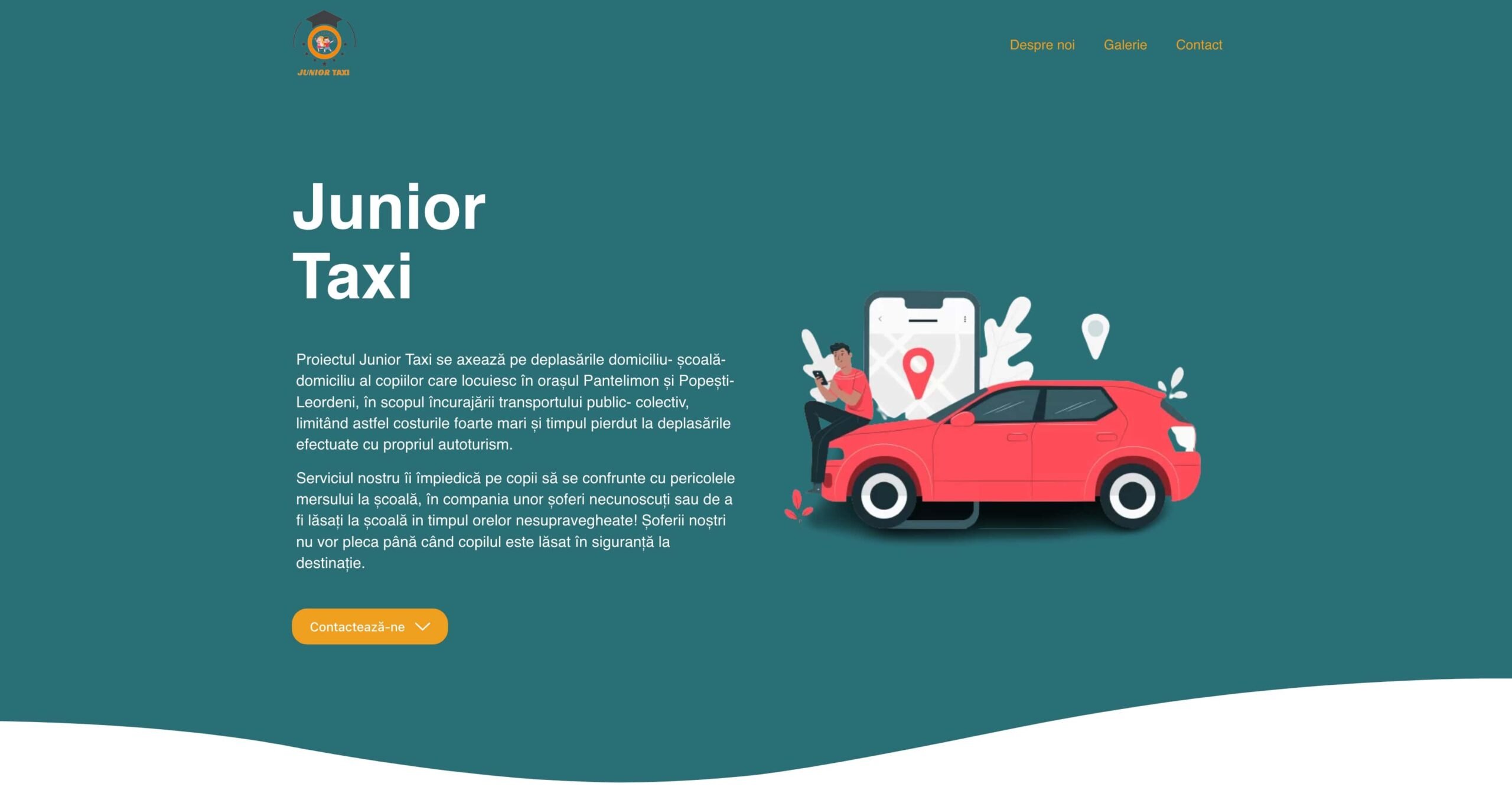
The Junior Taxi project focuses on the home-school-home trips of children living in Pantelimon and Popești-Leordeni, with the aim of encouraging public-collective transport, thus limiting the very high costs and time lost when traveling with their own car.
The service prevents children from facing the dangers of going to school in the company of unknown drivers or being left at school during unsupervised hours! Our drivers will not leave until the child is safely dropped off at their destination.
How’s the website structured?
Having an interest in presenting the full story of Junior Taxi, together with our client, we decided to present the business from top to the bottom. The website is very simple, clean, designed responsive, and has user experience up front.
As you can see in the headline image, the first section of the website tells a small intro about who Junior Taxi is and describe the service.
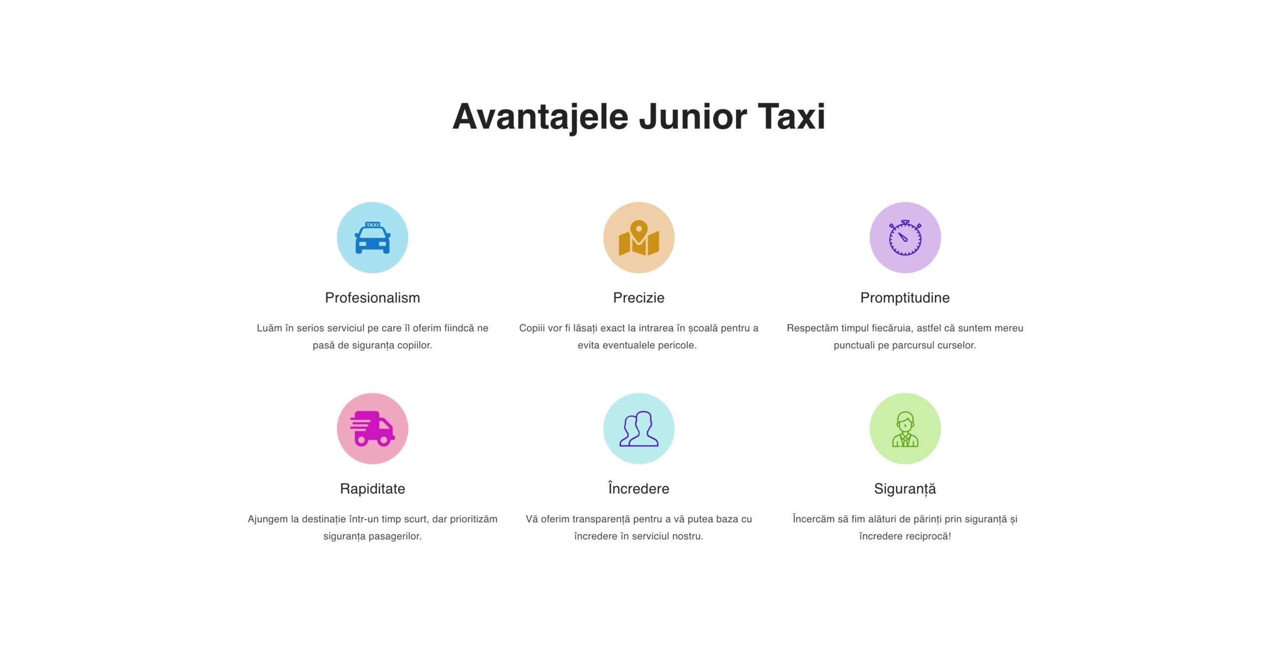
And right below you need to know what advantages they offer, which should intrigue the reader, right? Is like a funnel, you discover the service and what’s about, then you learn about the advantages offered, and now you’re intrigued to discover more, so let’s dive deeper, but look at the following section before, is it clean and eye-catching?
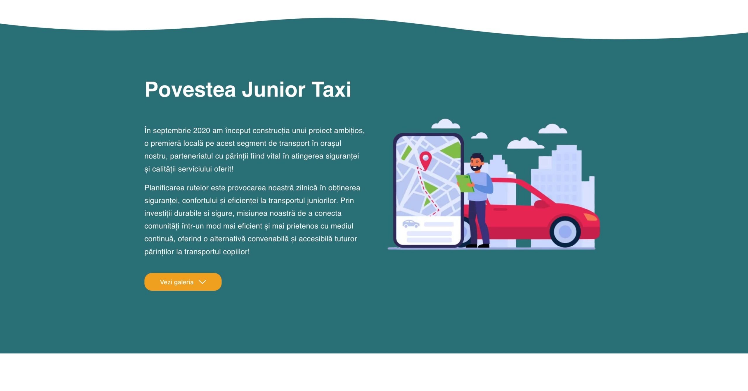
But what’s the story, why they decided to do the business, who’s behind it, and why? Look at the next image, because this is “our story” section, where the business offers the context for its customers.
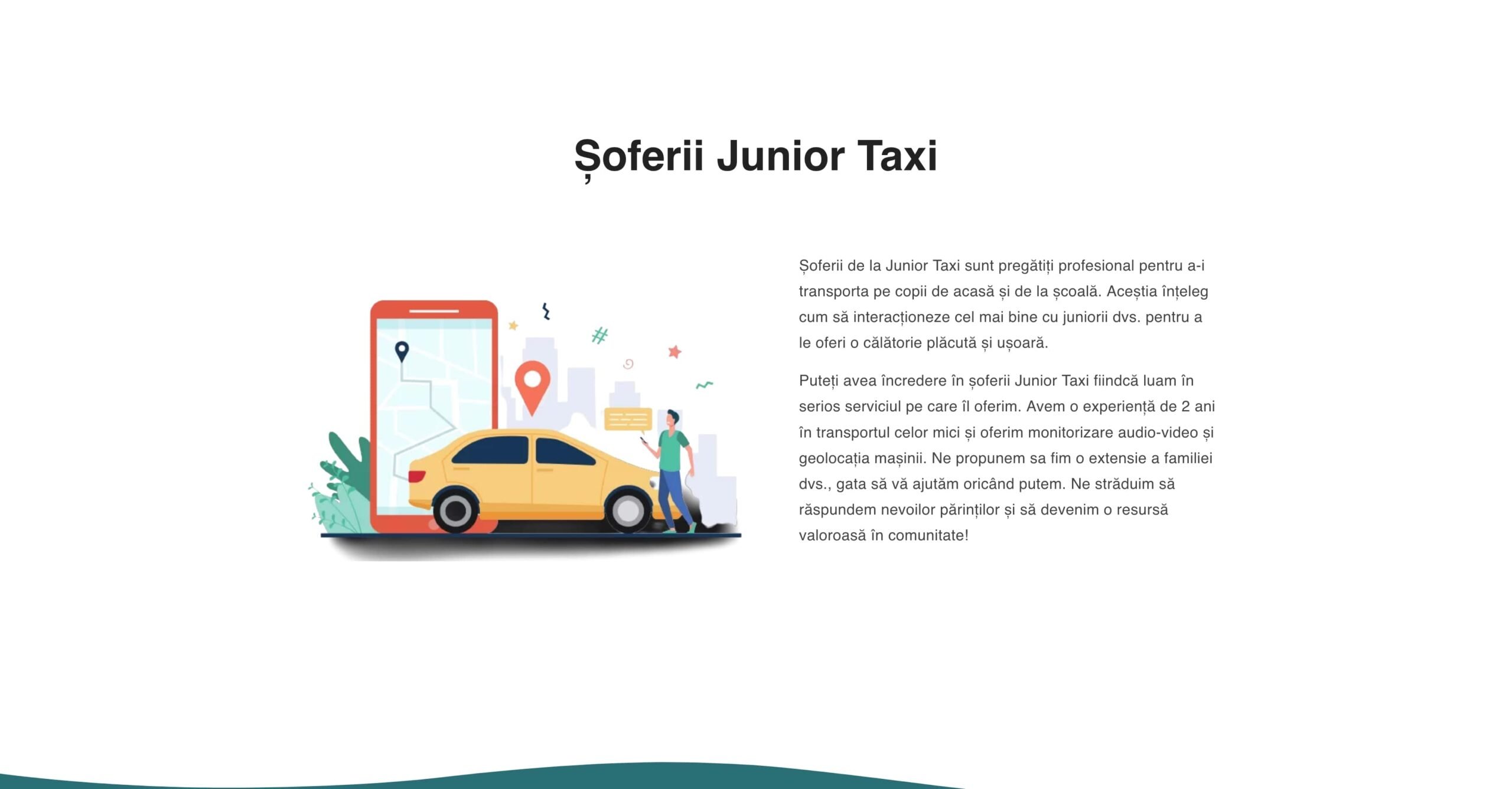
And what about their drivers? In the end, this business should take care of your children, so we need more about the drivers and how they take care of the children. That’s why right above we detailed more info.
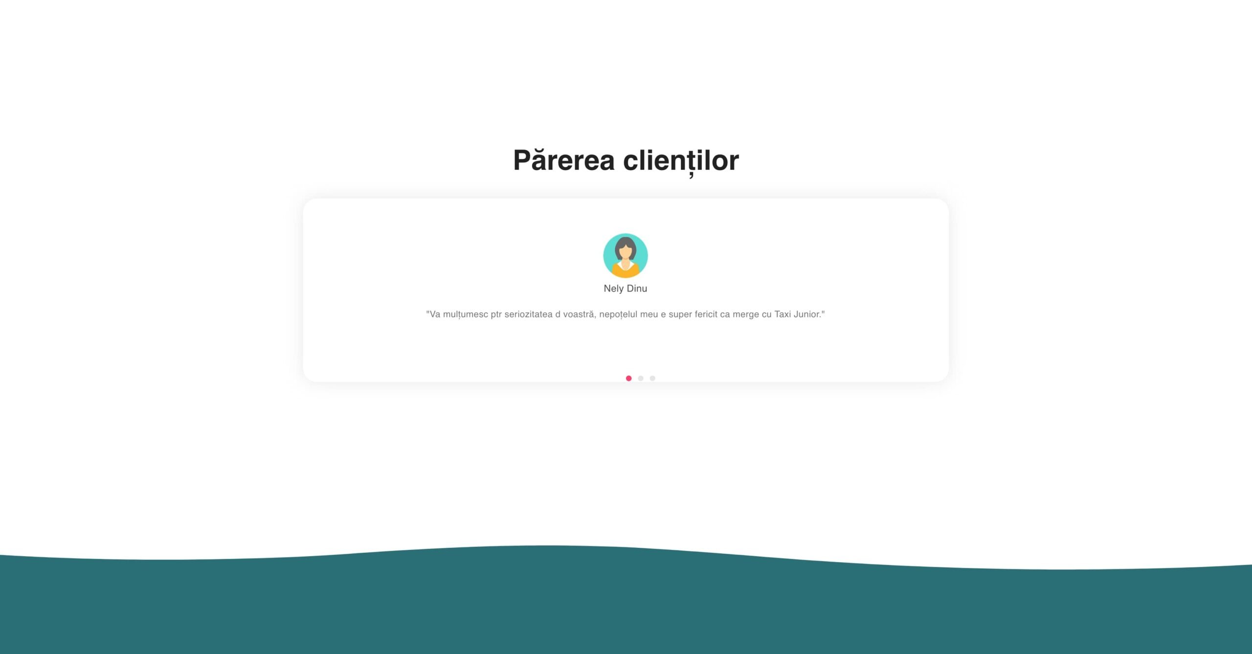
Every business represents the sum of its mistakes. What if they don’t have mistakes, who’s there to prove it?! The customers, and their feedback. Every website must have a section where you prove your relationship with customers.
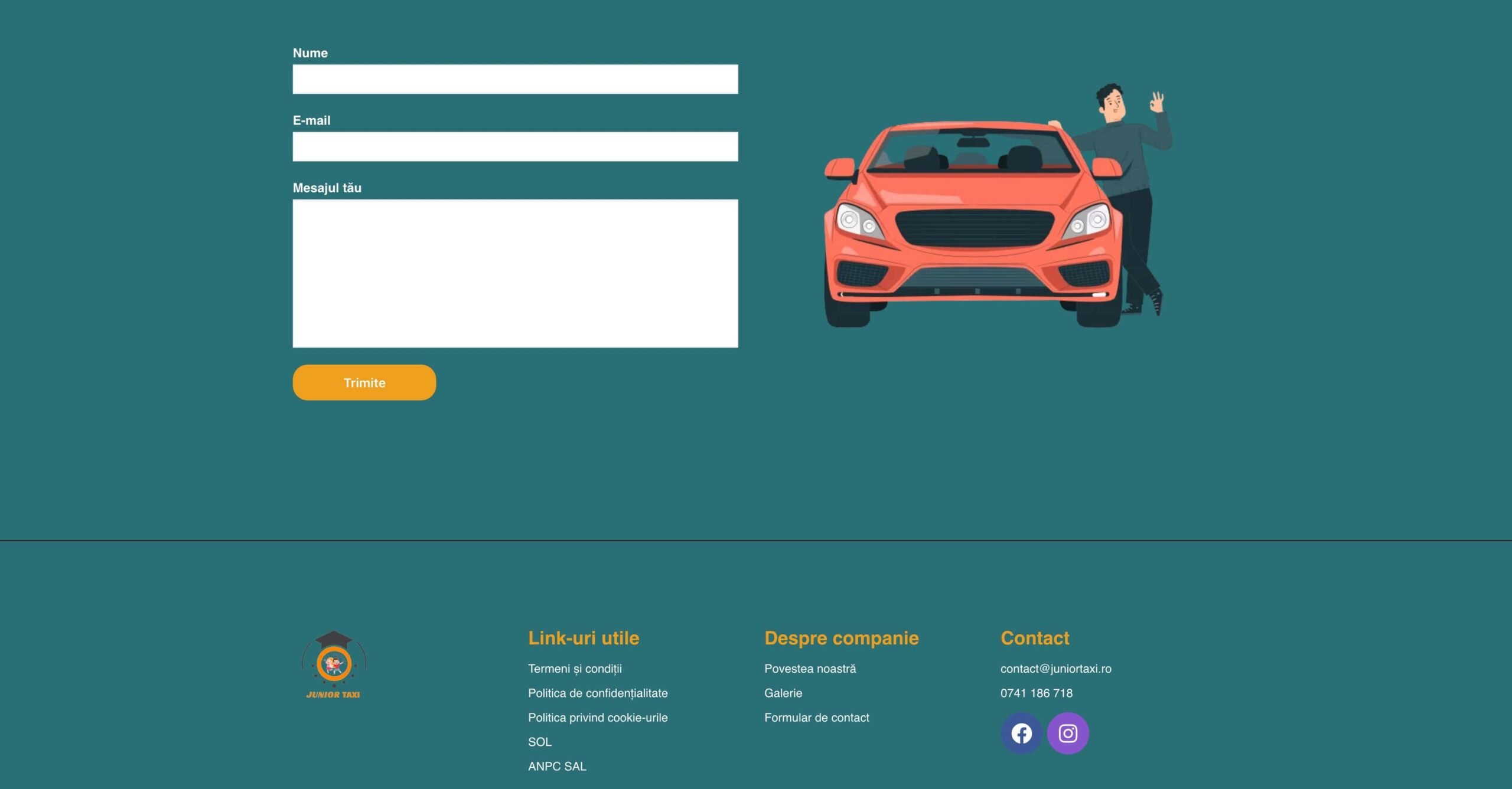
You should have a clear vision after this whole page of why you should contact their services, and how you can end better the page, than filling out a contact form?!
The footer section contains all the utils info and summary contact details.
Technologies used for development
Our team recommended the implementation of a software solution using the WordPress CMS, and the programming solution was made a hybrid with a plugin + custom changes. To facilitate access and quick changes, directly by the client, we used the page-builder Elementor. The development was carried out within 1 week.
What do you think about this project? We loved working on it and are so thankful for the opportunity to showcase it in our portfolio.


